On Book Design
- Hadia Mawlawi
- Nov 17, 2021
- 9 min read
Updated: Nov 18, 2021
"What an astonishing thing a book is! It’s a flat object made from a tree with flexible parts on which are imprinted lots of funny dark squiggles. But one glance at it and you’re inside the mind of another person, maybe somebody dead for thousands of years. Across the millennia, an author is speaking clearly and silently inside your head, directly to you. Writing is perhaps the greatest of human inventions, binding together people who never knew each other, citizens of distant epochs. Books break the shackles of time. A book is proof that humans are capable of working magic.”
—Carl Sagan

The Book: A Cover-to-Cover Exploration of the Most Powerful Object of Our Time, 2016, available through WW Norton & Company
What's in a book?
Perhaps a story, or information or a window into another world.
But a book is also the end product of a creative endeavor that starts with an idea and a manuscript. It is the inter-connected relationship between author, editor, publisher, designer, manufacturer and reader. It is also the complex relationship between text, images, layout, paper and color. What's in a book is much more than the transmission of a story. It is a tale of nearly endless decisions about style, aesthetics, function, and end use.
To begin the design process, a designer must ask some basic questions such as What is the expected trim size? How many characters per page? What is the number of pages? Who is the book for? What is the book about?
To provide answers to some of my questions I approached Lana Rigsby, founder of Rigsby Hull (her eponymous design firm) and an internationally respected book designer. Lana is the recipient of numerous awards for work done over her thirty-year career, including books for the Museum of Fine Arts Houston, Graphis, and a recent commission for the state-of-the-art Mercedes-Benz Stadium, for which she was asked to design a private, limited-edition commemorative monograph.
1- How much of the manuscript do you know before you begin designing the book? Why does it matter? or not? Persian legend has it that every newborn child begins as a soul floating amorphously through the universe, formless until it attains the body it will inhabit for life. For forty weeks the gods mold a body uniquely matched to the needs and intentions of this singular soul, and at the moment of birth spirit becomes flesh—body and soul inseparably entwined in a single form. By this time so much will have been preordained: Is this individual imposing or delicate? Tall or short? Dazzling or plain? The gods will have already decided. This is a good analogy for books, which come into the world in exactly the same way. At first a book is an idea, the pure raw material of thought, words floating in air. Setting those words in text is the first step toward giving them form, and it is the designer that fuses form and content into one physical expression. Choosing a font is the first decision, as typography is the foundation of the book's design. After that comes a thousand other decisions: how will the book open? What is its size? How does it feel in the hand? What’s the weight and grain of the paper, the stiffness or flexibility of the cover and binding? What impression will infuse a reader’s subconscious as the pages turn? A designer must know the manuscript intimately and understand the writer’s intent to make these decisions. If it is true "books prove that humans are capable of magic", then designers create the instrument by which that magic is conducted from the author’s mind into the reader's. 2- What are the considerations you make in selecting a typeface? During our recent meeting about book design, you brought up Beatrice Warde and her idea of the crystal goblet; will you tell our reader about it? Letterforms are the vessel that carry the words—the cup that holds the wine. Too ornate, and the font is a golden chalice that calls attention only to itself, obscuring what it is meant to convey. Too plain, and your Mouton Rothschild has been served in a paper cup. A timeless essay by Beatrice Ward published in 1956 likens good typography to “a crystal goblet: clear, as thin as a bubble and as transparent, calculated to reveal the beautiful thing that it contains.” That is as perfect a description of typographic design as I have ever heard, and it is the standard to which I hold my firm's work.

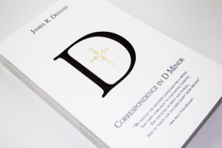
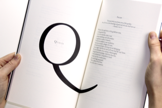
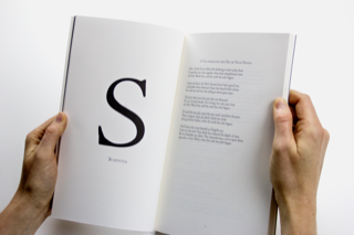
James R. Dennis is a poet, a Dominican friar, and a beloved friend with whom I have collaborated on seven books. Correspondence in D Minor was his poetic debut. The works in this book are presented as fictional letters to/from literary, historical, and Biblical figures. For typography expressive both of these poems’ and of the poet himself, we chose a classical font with early Christian roots: Cloister, a descendant of the blackletter font used in the first Gutenberg Bible. The large illuminated capitals throughout the text are a subtle homage to the iconic design of James Joyce’s Ulysses, reflecting Dennis’ Irish identity and spelling out a hidden message over the course of the book.
Image credit: Correspondence in D Minor, 2016, designed by Rigsby Hull, available through the author

image credit: Image credit: Ulysses, designed by Ernst Reichl, 1922, first edition available through Abe Books
This author's newest poetry volume, Listening Devices, is set in a Roman/Italic font pair designed by an English gravestone-mason and named after two barbarously murdered third century martyrs, Vibia Perpetua and her pregnant slave Felicity.

Image credit: Listening Devices, 2021, available through the author
The literary opposite of James Dennis' beautiful poems are the fabulously sexy crime novels of Miles Arceneaux. These books are set in Impact, a font sported by The National Enquirer's original masthead. Bold stripes, bright colors, and in-your-face typography combine to create an instantly recognizable brand identity for what this author bills as a series of "wickedly witty whodunits".

Image credit: The novels of Miles Arceneaux, 2013-2017, designed by Rigsby Hull,available through Amazon
3- Do you commission custom typefaces, illustrations, and/or photography for the books you design?
It is rare these days that a designer doesn’t commission these things! It is a wonderful way of tightening the form/content relationship and establishing a book's presence. One example: a few years ago we worked on a tremendously exciting project: a book exploring the question of how media shapes messages. Collaborating with neuroscientist Dr David Eagleman I wrote an extended essay exploring how human brains process information delivered on paper vs communication presented on less tangible electronic media. The book’s design was to reflect the precision and beauty of science. Titled A Communicator’s Guide to the Neuroscience of Touch, the piece features images adapted from an 1842 medical classic: the Atlas d’Anatomie Humaine et de Chirurgie, a magnum opus of eight massive tomes comprising the world’s first comprehensive surgical guide. The Atlas' spectacular lithographs by French artist Nicolas Henri Jacob are today considered among the loveliest in medical literature.

Image credit: A Communicator’s Guide to the Neuroscience of Touch, 2017, designed by Rigsby Hull, available through Sappi

Image credit: A Communicator’s Guide to the Neuroscience of Touch, 2017, designed by Rigsby Hull, available through Sappi
We commissioned Jonathan Hull to update them, replacing the brains in Jacobs’ illustrations with intricate, digitally rendered neural network maps. We considered typography, starting with the Atlas' signature typeface and its fascinating backstory.

Image credit: Original illustrations from Atlas d’Anatomie Humaine et de Chirurgie, 1842, by Nicolas Henri Jacob, housed the Thomas Fisher Rare Book Library, University of Toronto

Image credit: Specimen de la Nouvelle Foundrie, 1842, designed by Jules Didot, housed in the Bibliothèque Nacional de France
The font's designer, Jules Didot, was part of a dynasty that was to typography as the Bach family was to music: four successive generations of artistic geniuses who dominated their field for two centuries. Didot and Bodoni—two of hundreds of fonts designed by the Didot family—are considered among the most elegant ever created and instituted the “Modern” typeface classification. Ever the innovator, Jules replaced Didot’s sharp edges with rounded ones to create the beautiful letterforms used in Atlas d’Anatomie Humaine et de Chirurgie. This rounded font appears never to have been published again after the Atlas. When we discovered it, the face (incredibly) had not yet been unearthed by today’s foundry type revivalists. For us it was like finding buried treasure! Locating Jules Didot’s original 1842 Specimen de la Nouvelle Founderie in the musty archives of France's Bibliothèque Nacional, we commissioned James Puckett at New York’s Dunwich Foundry to recut this face as faithfully as possible. We named the newly digitized font "Science Modern" after the “Modern" classification originated by the Didots.
4- How much consideration do you give to the cover compared to the rest of the book?
We think of book covers a bit differently in the US vs. in Asia or Europe. Here, they are often considered “packaging" and controlled by marketing departments hoping to spur sales. (“Place the title in the top third of the cover, please, and make it BIG!”). European and Asian booksellers tend more to organize books in series, and use design to unite them visually within either themes or publishers. Books exist not only as an individual experience but also as part of a larger curation of themes and ideas. Formats repeated across multiple publications imply a rational consistency of thought.

Image credit: Bibliothek Suhrkamp series from the German publishing house Suhrkamp Verlag 1955, designed by Willy Fleckhaus, collection of Lana Rigsby
The iconic German designer Jan Tschichold went so far as to consider book design a moral practice, committing himself to a strict philosophy of color (orange for fiction, green for crime, blue for biography) and tightly consistent grids and typography. But neither position strikes me as exactly right. A book’s cover is not a marketing device nor a passive container—it is the first veil to drop in an active process of revelation that will continue throughout the volume. Knopf’s legendary book designer Chip Kidd calls it a dance between clarity and mystery. The thick woolen felt cover of Eight Rugs Eight Stories, A Literary Sampler strikes that balance, its carpeted surface beguiling readers to see rugs as silent witnesses to lifetimes of human drama on the way to revealing what stories they would tell, if rugs could speak.
image credit: Eight Rugs, Eight Stories: A Literary Sampler, 2015, by Rigsby Hull, collection of Carol Piper
A limited-edition monograph about one of the landmark buildings of our time, Atlanta's Mercedes-Benz Stadium, features the Stadium’s groundbreaking ocular roof sculpted in its plexiglass slipcase. Gilt edge-printing (a 10th century bookbinding technique) turns the book’s sides into an extension of the cover, revealing the city skyline as the book is opened.
Image credit: Art, Architecture, Icon: The Mercedes-Benz Stadium, 2019, designed by Rigsby Hull, not commercially available
video showing the gilt-edge sides
5- Book design has come a long way since the days of papyrus scrolls and hand-bound codices. Is more innovation possible? or are printed books to be replaced by e-readers?
Books were the province of a privileged few until Johannes Gutenberg's printing press made them accessible to the masses. Digital printing, infinitely cheaper and faster than offset, has been the next giant leap forward. Print-on-demand makes it practical to produce much smaller editions, to self-publish, to customize or personalize books within an edition, and more—all creating an explosion in the amount and variety of content available to readers. Slipping interactive content and/or augmented reality into a printed book lets the designer add video, text, and other information. For example, both our Neuroscience book and the Mercedes-Benz Stadium monograph contain scannable icons, or triggers, that lead readers to video and audio files that enrich the experience immeasurably. These innovations aren’t yet perfect. The quality of digital printing varies a lot and is nearly always inferior to offset, and augmented reality requires readers to download apps that must be forever maintained by the publisher. There's lots of room for evolution and improvement. But with books continually becoming richer in content and quality and cheaper to produce, I am betting that people will keep reaching for them long after they’ve shut down their computers for the night.
6- What is your favorite aspect of designing a book? I love designing books, but I am also acutely aware of the limitations of design. There are only so many facets of the reading experience that can be "baked into” a book. The communion between author and audience, story and reader, is something that comes to life—or not—with every volume of poetry, every novel, every picture book, every sacred text. Preparing for this interview I was delighted to discover that Beatrice Warde’s editor selected The Crystal Goblet’s sixteen essays by “sifting through various clippings and fugitive pamphlets that had been carried about in the pockets of teachers..., foremen..., and others whose thumbs bore traces of printer’s ink, to see which bore the most thumb-prints and other evidences of hard wear”. The author noted that,“To a writer there could be no more gratifying kind of ‘printing' that which such thumbs transfer to paper". My own bookshelves are stuffed to overflowing with volumes bearing inscribed messages, margin notes, and memorabilia; worn and dog-eared pages; wineglass stains and cracked spines. No book of mine is too precious to become real, in the Velveteen Rabbit’s sense of what that word means: “Real isn't how you are made. … It’s a thing that happens to you when someone loves you for a long, long time.”I suppose my favorite moment as a designer comes when a book is finished—its body and soul comfortably one—and ready to ship out into the world. For just a minute I contemplate what might happen to that book on its way to becoming real, and I imagine someone loving it. 7- Is there anything else you would like to share with our readers? Yes! I feel very lucky to have been a practitioner of this time-honored art-form for so many years now. Creating books has been one of the great loves of my life.
Thank you so much Lana for sharing these insights and opening our awareness to the craft of book design and all the considerations behind this timeworn tradition. I am particularly fascinated by the neuroscience of touch and the work you did with Dr. David Eagleman. It's a fascinating topic that helps me understand why I return to books even in the age of the tablets. I hope our readers gained a new appreciation for the art of book design and all that lies behind the cover.
Happy Reading!


Comments